Designers (particularly those in Government):
You're busy tinkering with AI, oh-so-thrilled to be on the cutting edge of technology, trying to find use cases for it in complex, difficult problem spaces (spoiler alert: there are no uses cases and you're just burning the planet).
Meanwhile, Japan is busy doing the hard work. They've just celebrated one year of ending the use of floppy disks. Yes, floppy disks.
Their Digital Agency scrapped 1,034 regulations governing the use of floppy disks. Let me spell that out:
One thousand and thirty four policy changes.
One thousand and thirty four regulation edits.
One thousand and thirty four bits of hard, dense, unsexy work.
That's the work the matters. You can't just point AI at a problem like floppy disks and write a clever prompt to make it go away.
You have to do the hard work.
Do
the
Hard
Work
(I think I'm going to turn that phrase into a poster and put in on the wall behind me. Let me know if that's a good idea and you would want one too! Because that will 100% increase the likelihood of me actually doing it. No, I'm not lazy, I just know myself; lots of ideas, too many to execute them all.)
Disservice Standard
HP is garbage. They’re a terrible company that’s actively hostile to its customers.
First, they added a minimum 15 minute waiting time for telephone support calls. Then, they were caught and backtracked.
This was going to be a post about service design, the use of dark patterns, design ethics, and the people who made this decision and the people who went along with it to implement it.
Instead, I'll leave you with this, courtesy of the incomparable Maya Angelou:
“When someone shows you who they are, believe them the first time.”
Volkswagen At the Movies
If you’ve been to the movies recently, you might have noticed an unlikely co-star: Volkswagen.
They’ve been clumsily, ham-fistedly cramming their vehicles into all kinds of movies*. It's so blatant that I can't imagine it makes anyone think positively about the brand or want to buy a Volkswagen.
Take Godzilla x Kong: The New Empire. Admittedly, it’s a popcorn blockbuster and by no means a “Good Film of Important Cultural Value” (the clumsy name alone might have given that away).

That said, there’s absolutely no reason for the above shot to exist. It doesn’t end the scene. It doesn’t advance the plot. It’s not important for the audience to see the characters leave in a car.
This shot exists for one reason and one reason only: product placement. It’s an ad, sitting right there in the middle of the movie. The car is perfectly lit, perfectly angled, and dead centre in the frame. It's a glamour shot straight out of the last seconds of a bog-standard car commercial. And it’s there because the studio and Volkswagen think you’re too stupid to notice, or too inured to care.
I don’t mind subtle product placement or even overt product placement, especially when it’s done well. But the example above shows a sheer lack of respect for the audience.
*: I won’t even get into Volkswagen’s partnership with Miraculous Ladybug & Cat Noir: The Movie because the movie is poor at best, and the placement extends even beyond the film into concept cars and ads with the characters.
The Thing About the iPhone …
… is that it lets people make weird, wonderful things. Weird wonderful things like ¡Suerte! – a short film hosted on Apple’s YouTube channel about a young musician trying to overcome a creative block and find his musical sound.
This, of course, requires a hero’s journey. On his journey, he’s accompanied by a giant fish, meets Death, a mermaid, and then the Devil.
It’s oddly compelling, beautifully done, and proof that the best camera is the one that's with you.
Oh, and it features this beautiful little homage to Kubrick’s The Shining:
A Return to Blogging
The internet used to be fun.
People had personal blogs. They were strange, wonderful things. (I had one too †!) You’d stumble across a new blog through a sidebar link, or someone would email you a link, and you’d find yourself on an entirely new corner of the internet reading a complete stranger’s writing. I remember reading a waiter’s secret diary, the misadventures of someone determined to learn to cook more than just pasta, and a host of others. I read my friends’ blogs while they travelled, mused, or straight up just complained. I had these sites bookmarked (when that was also a thing). The best part? The weirdness. People posted about anything they wanted and nobody was concerned about looking professional or being a subject matter expert.
Blogging on the internet was freeform, it was wild, and it was great.
Slowly (suddenly?) though, personal blogs started to die out. Part of it was monetization – the waiter got a book deal (well done, you!), the chef got a cook book deal (well done, you too!). Posting became less frequent. The idea of writing for yourself seemed to become distasteful, an indulgent or even foolish pastime. After all, why write for yourself when there are Internet Riches waiting for you? All you need to do is optimize for SEO, keep up with the latest Google search trends, keyword stuff some posts, maybe run some ads, definitely get an Amazon affiliate link, and hey, you’re ever closer to Internet Riches. Never mind that the writing got worse, that the passion wasn’t there in the words, and that it all became less interesting.
I miss personal blogs.
Today, there are still some great ones: Jason Kottke, Cabel Sasser, John Gruber, and Louie Mantia to name a few. I have no ambition to join their ranks or be a great blog (whatever that means), but I’m starting mine again, right here.
Bring on the weird.
† It ran on Blogger, long before Google had acquired that service, with third-party commenting functionality provided by [Haloscan][1].↩︎︎
The Service Standard Has Changed
Recently, I was chatting with friends who run a bakery in London, UK. They’re slowly going about re-opening their business as the pandemic restrictions are being lifted. The biggest change they’re making is to accept online orders for pick-up.
This isn’t unique. Many of the independent grocery stores nearby are now offering kerbside pick-up. Fine dining restaurants have adapted their menus to offer delivery-friendly alternatives, such as “cook at home” bundles. Others have innovated in unexpected ways – one particularly clever example of this is Joeys’ offering on Door Dash. In addition to meal kits, they’ll also happily sell you basic groceries from their inventory: milk, cheese, eggs, meat, spirits, and even toilet paper.
The pandemic has changed the service standard. It’s done so in ways that are truly disruptive, regardless of industry or sector. More importantly, it’s changed it in ways that will be lasting.
Because when this is all over, and life returns to normal (for a value of normal that we don’t yet understand),the demand for these services won’t disappear. If today, I can get beer from my favourite, independent brewery delivered to my doorstep, why would I ever go to the liquor store, where I run the risk of it being out of stock? If I can have my favourite coffee beans delivered to my doorstep, why travel across the city to buy them at the one café that stocks them (again, running the risk of them being out of stock)? Every small business needs to be considering ways to ensure they can meet – and continue to meet – the new service standard.
Mini Book Review: Blacksad

I picked up Blacksad from the public library without knowing anything about it, except that it had made a number of critics’ lists.
Based on the cover image I saw online, I thought it would be about a Puss-in-Boots character or some such. It turned out to be two of my favourite (but very different!) things: watercolour artwork, and film noir.
The eponymous character is a cat who’s a private eye in a world populated by animals. All the tropes of film noir are there – guns, gangsters, goons, and dames – and they serve as a strong contradiction to the Disney associations that come with anthropomorphised animals†. The story lines are also hard-hitting, sombre, and heavy.
The artwork is absolutely stunning: pen and ink with watercolour washes of muted, eerie colours. Each frame is literally a painting:

And framing like this, while it might seem a bit heavy-handed, is not just powerful, but a perfect homage to the film noir genre.
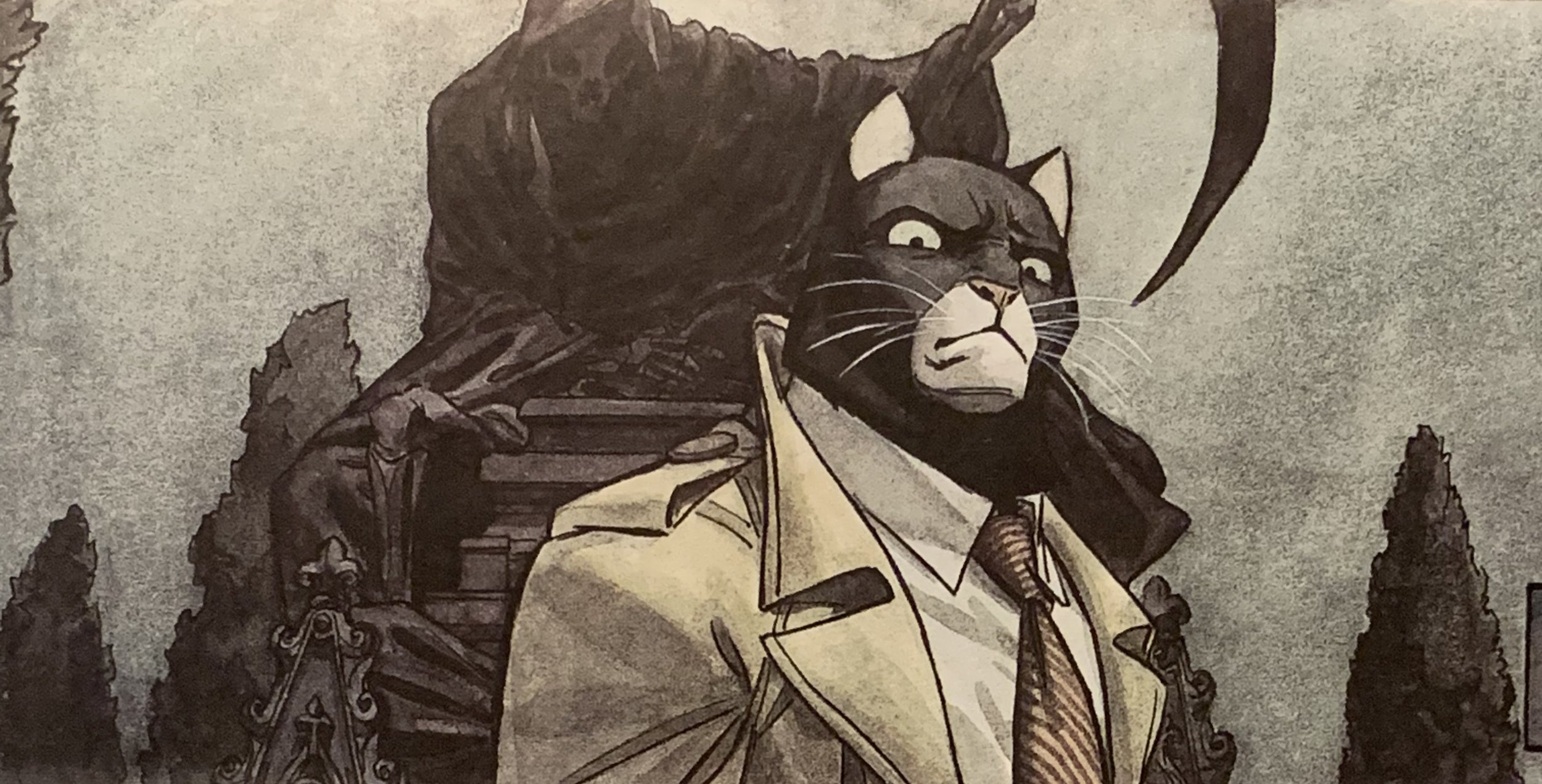
I loved Blacksad and ended up finding and devouring the rest of the books, all of which were as good as the first. If you enjoy graphic novels and are a fan of film noir, I can’t recommend this enough.
You can buy Blacksad online from: independent, Indigo, Amazon.
† It’s no coincidence that the artist, Juanjo Guarnido, worked for Walt Disney Studios in France.
Conference round-up: 2019

On stage at Design and Content Conference, 2019
In 2019, I had the honour and immense pleasure of speaking at six conferences, two government-only conferences, and being on two panels. And in seven different cities no less!
For the most part, I spoke about the work my team and I are doing as part of the Canadian Digital Service, but I also spoke about my own journey as a designer at Ladders. I’ve updated my Speaking page and you can watch some of these talks online:
“Paths to Self-Discovery” (25 minutes), closing keynote from DesignX’s Ladders conference for early stage designers.
“Designing Our Nation”, (35 minutes and 20 minutes of Q&A) closing keynote from the Design and Content conference.
The early days are the toughest

Originally published in the Service Gazette, online and in print.
From MOJ to CDS
That observation stands out when comparing a nascent digital government service to a mature one. It’s one I’ve made countless times in the past nine months in my role as the Chief of Design for the Canadian Digital Service (CDS). CDS is a relatively new initiative from the Government of Canada with a straightforward mandate: to design and deliver simple, easy to use services for all Canadians. This idea isn’t new; CDS has been deliberately modelled after other successful digital services in Europe and the United States.
Prior to CDS, I was the Head of Design with the Ministry of Justice (MOJ) Digital team, part of the Government Digital Service’s work to transform the UK government. When I started at MOJ, it never occurred to me that it was a mature organisation as both it and GDS had already won many hard fought battles.
On my first day at MOJ, I added my government email and calendar (both enterprise Google) to my personal iPhone and set up my collaboration tools (Trello, Slack, Confluence, etc.) on a brand new MacBook Pro. None of this seemed extraordinary to me — it was par for the course, especially given my previous 18 years in the private sector.
In contrast, my first day at CDS was a poignant reminder of the differences between a mature organisation and a nascent one. it issued me three devices: a smartphone, a (worn) Windows tablet, and a MacBook. Setting up my government email on my smartphone took half a day. Unblocking the web-based collaboration tools from the government internet took months. As for the Google suite of products, it took just under a year to receive approval to use them in a limited capacity.
Spearheading the digital transformation movement in Canada means that even procuring cloud hosting has required a Herculean effort. It’s only due to the persistence and dedication of a few key CDS people that we’ve been able to recently acquire cloud hosting. In comparison, during my time at the MOJ, most delivery teams had embedded developer operations and spinning up new cloud instances was done without a second thought. Currently, modifying our cloud hosting would need more approvals — something we’re now working to try and change.
The differences and their associated challenges extend to far more than these small, concrete examples. So much of our work at CDS is around change management, affecting culture, and challenging the existing process. Sometimes, it’s even about convincing people that our way of working is both an improvement and feasible!
At MOJ, conducting user research was a normal part of the service design process. Early on at CDS, the research of one of our delivery teams abruptly stopped due to perceived privacy and consent issues. It took several weeks for us to resolve these issues and push forward. Moments like this reinforce that the work of CDS isn’t just around service delivery, it’s also around culture change.
Part of that culture change is demonstrating the value of a service design approach and educating our partners about what that entails. I’ve found that inside the Government of Canada, design is often perceived as being one of two things: graphic design or usability testing. To deliver on our mandate, CDS spends a considerable amount of time educating our partners as to how a user-centred design process works and what that process looks like when applied by an agile delivery team. We’ve had many conversations around what agile is and how it differs from waterfall software development. We’re still asked for “a bit of design” to finish an iPhone app or for a detailed roadmap with timelines even before we’ve started our research.
So yes, the early days are the toughest. But I’ve learnt, having been through them a couple of times with startups in the private sector, that those early days are often the most exciting ones. The frenetic pace and the constant battles are slowly replaced with a stable, well-oiled workplace where new employees are effective sooner, meaning the work of transforming a government for its citizens happens faster. For me, the tough days mean we’re building a solid foundation for the future to deliver a big impact, not a quick one.
Interview with the UXers
While I was attending WAQ in Québec City, I sat down with Catherine Dionne of the UXers. We talked about the mission of the Canadian Digital Service, what we’re trying to accomplish, and what the future for digital services in Canada could look like.
Rotherhithe Farms Honey – From the Archives

My long-term collaborator and friend, Mike Wood, has put some of the most interesting projects across my desk. When we lived in London…
Read moreDesignX, Toronto
Before leaving the UK, I started looking around for professional associations, groups, and meetups in Canada.
I eventually found DesignX, Toronto's largest UX and Design community, and it's fantastic. They have a brilliant Slack channel that's teeming with activity. Whatever you're looking for, you'll find it there – be it tips for Sketch, prototyping tutorials, job postings, advice, or leadership guidance.
Preet Singh, the founder of DesignX, and I connected in October and he asked me to present to the community about service design and government services.
Despite getting stuck in traffic (long enough that I began to worry, Preet texted me, and I debated getting out and running!), I made it to the venue, gave my talk, and had a fantastic time meeting as many members of the community as possible. I couldn't have had a better time.
Read a Twitter Moment of my DesignX presentation→
View the slides from my talk:
Speaking at CanUX

Photo from a tweet by Anna Lissansky
On Saturday, November 4, 2017, I had the immense pleasure of speaking at CanUX, the largest UX conference in Canada.
It was my first time speaking at CanUX (I made the rookie mistake of wearing red on a stage that was mostly red) and I'm delighted and grateful that I got to be a small part of it. You should definitely attend next year!
Whenever I speak, I'm fascinated by the things that resonate with the audience. For instance, I really thought me calling out some service design as less than legitimate would go over tremendously with the audience. Instead, what stuck with the audience was moments like these:

Photo from a tweet by Josée Charbonneau

Photo from a tweet by Tyler Hilker
You can see the full slides from my CanUX presentation here:
A huge thank you to the Digital & Technology team at the Ministry of Justice – the case study I presented wouldn't have been possible without the hard work of many talented people. Similarly, I owe a debt to Steve Marshall, whose guidance and advice helped shaped my talk.
If you're interested in having me speak at your event or conference about design of all kinds, technology, and the intersection between the two, please get in touch!
Designing for Canada
After a decade in the U.K. followed by a short sabbatical, I'm delighted to announce that I'm going to be the first Chief of Design with the Canadian Digital Service, a new initiative by the Government of Canada.
CDS's mission is straightforward: to design, code, build and deliver simple, easy to use, accessible services for Canadians. When I first met the CDS team, I found a passionate, diverse group of people truly committed to placing user centred design at the heart of everything they do. It's one of the many reasons I'm delighted to join the team and lead the design practice.
Canadians expect web services, like Gmail and Facebook, to be easy to use and accessible. There's absolutely no reason why government services can't be the same. The United Kingdom’s success with GDS and the U.S.’s success with the U.S. Digital Service and 18F are proof of this. During my time with the Ministry of Justice in the United Kingdom, my team and I designed and delivered services that made thousands of people’s lives easier and, in some cases, saved them money. I'm excited and delighted to have the opportunity to do the same here back at home.
Since the launch of CDS this summer, the team's work and the scope of the projects has dramatically increased. CDS is going to be hiring designers of all kinds over the next couple of months. Please get in touch if you're interested in joining the team.
I firmly believe that there's no better opportunity to make an impact through design. At the Canadian Digital Service, you'll work on projects that matter, in an open, transparent, inclusive, and diverse environment, to make the lives of your fellow Canadians better. It's that simple.
In-App Diversity
For the past few years, I've been using Duolingo to improve my French. I've found it really useful and my proficiency in reading, speaking and comprehension has increased dramatically.
Some time ago, Duolingo introduced stylised illustrations of people speaking the phrases (I suspect this was in order to humanise and bring context to the exercises). While these illustrations must have presented an interesting challenge to the visual designers† as well as the engineers, the thing about them that immediately stood out to me wasn't the style or the execution.
Instead, it was the diversity.
There are illustrations of women, men, girls, boys, people of colour, people of religion, bodybuilders, twins, punks, skaters, hippies, policemen, lumber jacks, zombies, astronauts, and same-sex couples.
Just some of the Duolingo characters

Some of the more unique characters
Some of these depictions must be intentional. In the above image, a character who looks suspiciously like Hulk Hogan proclaims his embarrassment and two women of colour proudly state their love has no limits ( 🌈 ). And if I'm not wrong, that's Riggs and Murtaugh in the bottom left corner.
I absolutely love this. I can't remember the last time I used an app that actually had so much diversity represented in visual form. I think it's commendable in this day and age, to say nothing of the fact that Duolingo allowed their designers the time and the budget to render these characters.
Hell, they even included a bear.
† From what I can tell, the illustrations are the work of Gregory Hartman and are based on a standard template – libraries of heads and shoulders are mixed and matched with other libraries of facial features and accessories. Fantastic stuff.
Portrait Photography
Following up from my previous post on food photography, here's a portfolio of my commerical portraiture work.


Food Photography
For years, I've run a separate domain and website for my commercial photography. Recently, I made the choice to let that domain expire. But rather than let those photos disappear into the ether, I thought I'd publish them here on my blog.
Here's a selection of my published food photography:


Slack Glitch
Here's what happens when you encounter a major glitch in Slack, the productivity tool. All things considered, it's a rather nice way to make a bad situation a little less unpleasant for the user.
Choosy Icon
Choosy is one of those tiny pieces of software that quickly becomes indispensable. Its premise is beautifully simple: open the right link in the right browser, every time.
That premise belies its incredibly power though. Choosy also lets you set behaviours and customs actions. Always open mail:to links in Chrome? No sweat. Send a link from Chrome to Safari? Easy. The accompanying extensions – for all of the major browsers – make that a piece of cake.
I was introduced to Choosy by George Brocklehurst, a former colleague and Choosy's creator (when he saw me copying and pasting links between browsers). I used it for years and was dismayed when it finally stopped working because of changes in OSX.

The old version of the Choosy icon
When it came time to update Choosy, I happily took George up on his offer to update the icon. The previous icon felt complicated, especially given how simple Choosy is to use. In fairness, the original icon was a product of its time and reflected Apple's Aqua aesthetic with reflections, gradients, and 3D effects.
My goal for the icon’s redesign was to simplify it as much as possible. It needed to feel elegant, simple, and straightforward.
After some thought, I chose to base the new version on one of the original icon’s triangles. This creates a tie between the original icon and the new one. It's a strong geometric element and communicates the concepts of direction, navigation and movement.
Finding the proper balance of the C to the triangle proved to be a surprising challenge (turns out that mathematical alignment was completely visually wrong). I also found drawing a geometrically perfect triangle with rounded corners very, very difficult (I was trying to use the Pathfinder tool to merge circles with the corners of a triangle and then remove the negative spaces).
Eventually, I realised that Adobe had probably solved this problem. A quick Google search later and I used the incredibly simple “round corners” option. ಠ_ಠ
In the end, I’m very happy with how the final version turned out. A particularly difficult challenge was ensuring that the icon represented well at all sizes – as small as 16 pixels square, for use in the Apple menu bar and as a favicon (the 16 pixel square version actually has a slightly different layout and font weight to render properly).
The final icon. From left to right at 1024 x 1024, 512 x 512, 256 x 256, 128 x 128, 64 x 64 and the tiny 16 x 16!
And here’s what Choosy looks like when it’s running in your Mac’s menu bar:

You can buy Choosy for $10 USD. It’s worth every penny.
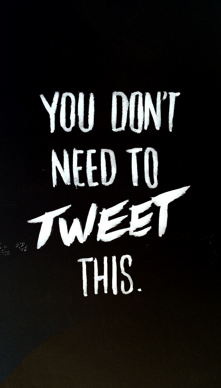
A suggestion for the New Year
With last year's being light-hearted, it stands that this year's sentiment is a bit more serious. By the way, the image above happens to be the perfect size for your iPhone's wallpaper.