Eva-Lotta’s Sketchnotes

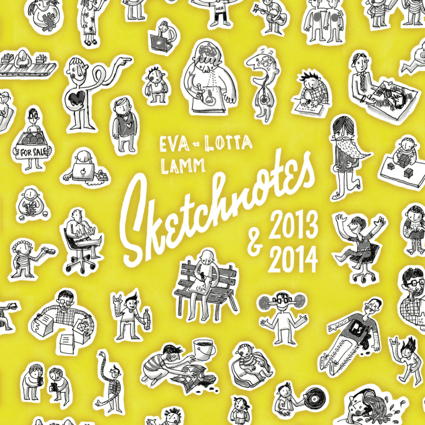
Eva-Lotta Lamm is well known for her sketchnotes, beautifully drawn notes taken on conference talks.

Back in 2013, my friend Steve Marshall asked me to speak at the Expedia Summer Symposium. Steve knows Eva-Lotta from their time together at Yahoo!, so I didn’t think anything of seeing her at the evening. Also, I’d just started at Expedia that week and was singularly focussed on delivering a good talk.

I spoke about how wayfinding is an intrinsic part of the human brain’s spatial awareness (memory palaces!), how this should be applied to signage systems, and how it can benefit the web.

A few weeks later, Eva-Lotta messaged me to tell me that her sketchnotes from my talk were on Flickr. What I didn’t realise until April of this year is that, for the fourth time, she compiled all of her lovely notes into a book.

She sent me a digital copy and it’s a great piece, full of lettering, beautiful sketches and genuinely interesting tidbits.

Go and grab a copy!

SuperLocate

In 2013, my friend (and former colleague at Reevoo) Chris Zetter released an iPhone app, SuperLocate. Like all good apps, it solves a problem that he had: how to find the nearest grocery store. 

I volunteered to help with the interaction design and the flow of the user journeys. Additionally, I contributed to the visual styling and the refinement of the app icon.

Overview

The app opens with half the screen devoted to a map view, and the other half a list of the nearby grocery stores. If the user touches the map, the list collapses. This allows the user to pan and zoom the map to refine their search.

Selecting a grocery store from the list brings up the hours of operation, as well as giving the user options for walking and driving directions, and calling the store.

Early Sketches

Sketch for main screen (top) and the About/credits screen (below)

Sketch of supermarket screen (top) showing opening hours, walking and driving directions

Sketch of supermarket screen (top) showing opening hours, walking and driving directions


Main screen

Main screen with listings visible

Supermarket screen

Supermarket screen

Icon design (from left to right): original, revised, alternate revised

The app is simple, intuitive, and a brilliant little side project from a very talented developer. Check out Superlocate (App store link) on the UK App store.

Eames and Delaunay Triangles

Recently, I was experimenting with a new illustration style. Rather than render an object in its whole, I abstracted the representation slightly by using geometric planes. At first, I tried using polygons but the overall effect was jumbled and not quite what I wanted.

After doing some reading about polygons and geometric planes, I eventually came across Delaunay triangulation. The mathematics behind them are fascinating but I was instantly drawn to their application to my problem.

After drawing a couple of simple objects with Delaunay triangles, I decided to apply them to an idea I had for a series of prints. My friend Steve is passionate about mid-century modern furniture and we’d recently had a conversation about the work of Charles and Ray Eames.

With that conversation fresh in mind, I drew the Eames’ classic chairs with Delaunay triangles, wrote a short history of each chair, and had the finished posters printed on a beautiful mocha FSC paper.

The finished posters:

Eames DAW (Dining Height Armchair Wood Base)

Eames DSW (Dining Height Side Chair Wood Base)

Eames DSR (Dining Height Side Chair Rod Base)

Detail of the so-called Eiffel Tower base

Detail of the so-called Eiffel Tower base

Detail of the DAW seat

Detail of the DAW seat

It was only after I finished my prints (and drawing hundreds and hundreds of precise triangles) that I discovered DMesh – a beautiful little piece of software that will render a vector version of any raster images with Delaunay triangles. Oh well. ;)

The Hype Machine II: The New Pornographers

Following up on my previous work for the Hype Machine, I was asked to create a piece of work representing the Canadian supergroup, The New Pornographers. I felt it critical to avoid the obvious connotations of the name so I created a piece of lettering whose aesthetic paid homage to the Rat Pack, the Vegas of days-gone-by, cocktail lounges and luxury.

The final piece


The Process

There were a couple of concepts that I considered for this piece: London tart cards (the postcards left by escorts in London phone booths), Times Square in the 1970s, and cheap ads found in the back of seedy men's magazines.

Times Square in the 1970s

Times Square in the 1970s

Tart cards

Tart cards

Sleazy classified ads

Sleazy classified ads


While sketching out possible layouts, it struck me these concepts and any variation on them were far too obvious. As such, I quickly wrote out a list of adjectives corresponding to my concepts and then tried to think of antonyms.

Classy, modern, and art house stuck out as keywords (classy appeared twice somehow). With these in mind, I then sketched out a couple of layouts before settling on the final piece.

cgovias-the-hype-machine-antonyms.jpg

The Faltering Hearts

The Faltering Hearts, a ukulele trio of women, approached me to design a logo for them. Their previous logos had been clichéd, obvious approaches based on hearts, usually accompanied by overly-decorative typefaces. Considering that the Faltering Hearts are quite a unique group, I suggested a hand-lettered approach to make the logotype feel human, distinctive and warm.

Read more

The Hype Machine: Camera Obscura

The Hype Machine asked me to contribute an illustration to their Annual Zeitgeist. With Camera Obscura as my chosen artist, I sketched a few different concepts, one of which was a highly-illustrative execution with inverted typography (like a true camera obscura).

In the end, I settled on the simpler execution above: lettering which references the pulp magazines and horror films of the 1930s. The application of texture to mimic shoddy printing and some scratch/hashed type helped round it off nicely.

IFTTT's Animated GIF

Animated GIFs in emails are by no means new but it's rare that one, like this one from IFTTT for its latest product Do, stops and makes me stare.

ifttt-animated-gif.gif

Just the right amount of animation, stretch, bounce and easing.

Mesmerising.


Update: in contrast, here's an example of what might be the dullest animated GIF ever to be crammed into a marketing email.

Yeast Bakery's Mince Pies

I'm tempted to say, right off the bat, that these are the best mince pies in London. If they're not, they're certainly a contender for that title, something I feel somewhat qualified to judge*.

Yeast Bakery's mince pies are beautiful. Every single part of them feels as though it was created with love, care and attention. The details are beautiful and carefully considered as well. When I picked up the box, I was immediately drawn to the paper tags, a lovely, off-white, natural paper with a lovely toot. When I complimented Angela (one of the owners) on the tags, she laughed and told me that she'd made the paper herself. Astonishing.

And then there are the pies themselves:

They're beautifully constructed and perfectly baked. The short crust pastry is surprisingly substantial and gives these pies a wonderful weight – they don't fall apart in your hand like the Duchy Originals. That weight only enhances the experience in that each pie feels more solid and more real than say, the thin crust mince pies from Konditor and Cook. As you'll see below, the pastry maintains its shape and rise even as it's being eaten. 

Form aside, they're delicious. The mince filling is rich, moist and perfect. It's a classic mixture of fruit and feels instantly familiar without being tired. It's a perfect example of how if something isn't broken, it shouldn't be fixed (Heston Blumenthal should take note). Frankly, I can't wait to go back this Saturday for more.

Yeast Bakery (map)
Arch 356
Westgate Street
London
E8 3RL
Open to the public Saturdays

* When I worked at Reevoo, a colleague brought in every single brand of mince pie available and we spent a morning tasting and reviewing them. He and I also once tracked the number of mince pies that we consumed in the month of December. It was well over 30 pies each when we called off the tally.