Film Logotype: Guardians of the Galaxy

I've written before about Marvel's attention to design when it comes to film titles and end credits and the new trailer for Guardians of the Galaxy is no exception. I'm rarely a fan of movie logotypes, particularly within the science fiction and action genres – they're often clichéd treatments involving chrome/metal, 3D extrusions, gradients, rough or degraded typography, and the same fonts.

For me, the logotype for Guardians of the Galaxy is the exception to the rule, in no small part thanks to its details. The 3D extrusion is minimal and elegant. While there's still a metallic treatment, it's somewhat unique in its subtly (compare it to any of the typographic treatments for any of the Robocop films, remake included) and in that the metal is rusted, worn and old.

But really, it's the details in the lettering that delight me: the way the letterform of the U accommodates its neighbouring A; the overlap of the T and the H in the smaller text. It shows care and attention to detail.

Film Titles: All Hail the King

I'm a big fan of the current series of Marvel Studios* films. Marvel has brought titles and characters like Thor, Iron Man, Captain America and the Avengers to the big screen with skill and passion, all while respecting the source material.

One of the things I enjoy almost more than the films themselves is the Marvel One-Shots – shorts that take place in the same universe and often deal with the minor or supporting characters. The latest of these One-Shots is"All Hail the King", which deals with events from Iron Man 3.

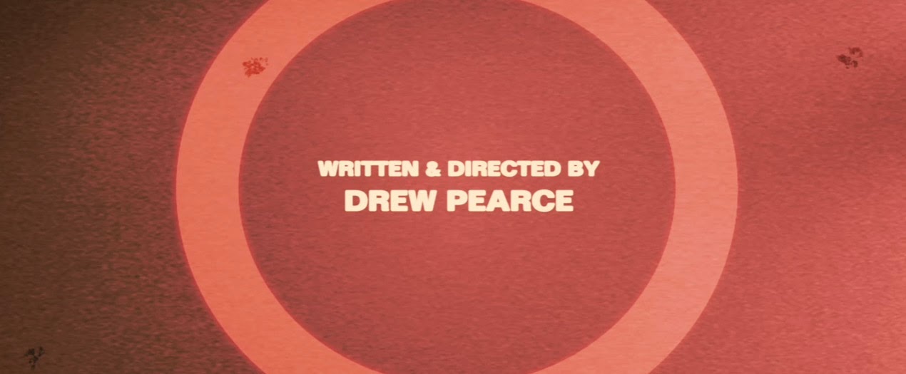
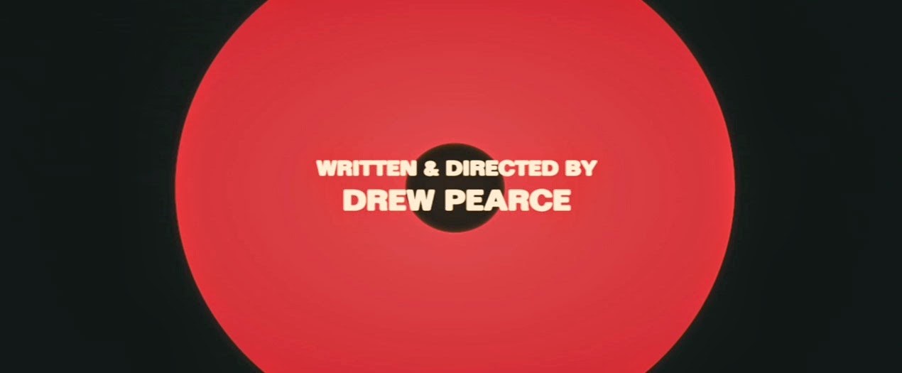
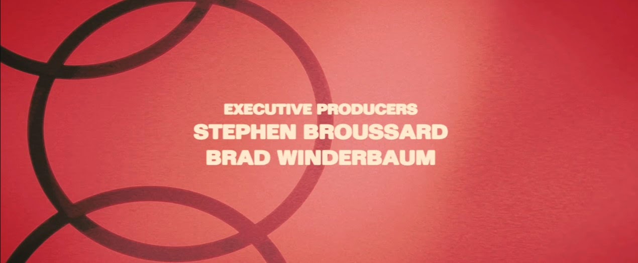
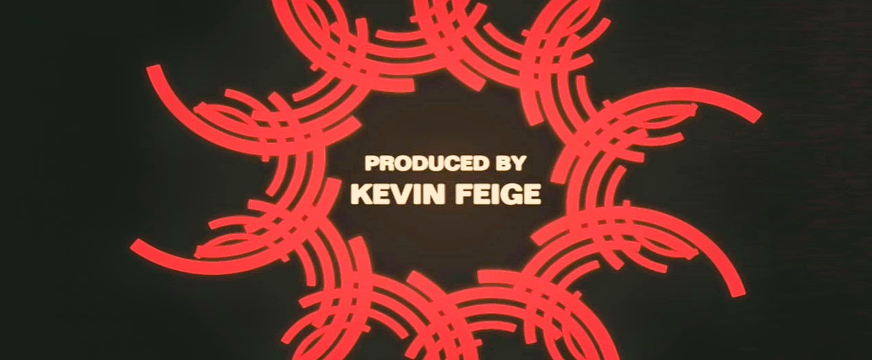
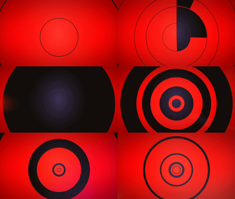
While the short is funny and very well executed, the best parts for me was the title treatment and the end credits. With visuals that would feel right at home in a late-70s exploitation or spy film, the titles are awash in colour, geometry and motion. They're a treat to behold, right down to the slightly fuzzy, indistinct letters.

The opening title treatment:

A few stills from the end credits:

And an example of the absolutely stunning (hypnotic?) animation:

The designers of the titles, Perception, wrote up their process for their website. It's a fantastic read and a great insight into their process and execution.

* As opposed to the Marvel properties currently being developed by other studios such as Sony's Amazing Spider-Man and Fox's X-Men.

New work: Valentine's Burgers

This is a tradition that L and I share: we've been going for burgers with friends on the 14th of February for nine consecutive years. That said, this is the first year I bothered creating an invitation for our little outing. I limited myself to a couple of hours on this one so there are a few problems here and there but you've got to admit: that's a pretty nice B.